Children’s Media Association
Studio: Freelance
Scope: Brand Identity, Iconography, Marketing Collateral
Location: New York, NY - Los Angeles, CA - San Fransisco (Bay Area), CA
Children’s Media Association (CMA) is a non profit organization that is comprised of industry professionals who are passionate about creating thoughtful and entertaining media to children and young adults. CMA supports their community by organizing educational events, promoting professional development, and helping their members lead, innovate, and shape the future of children’s media.
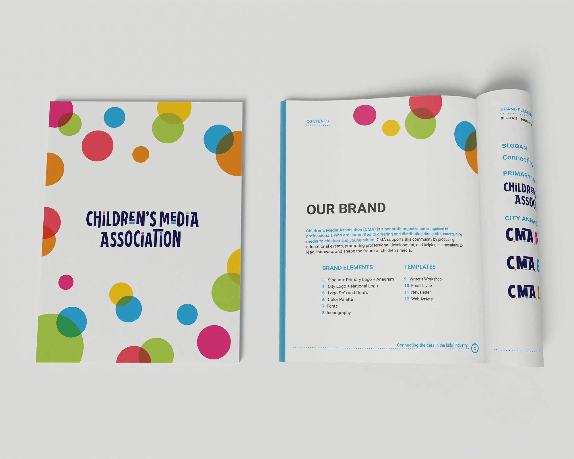
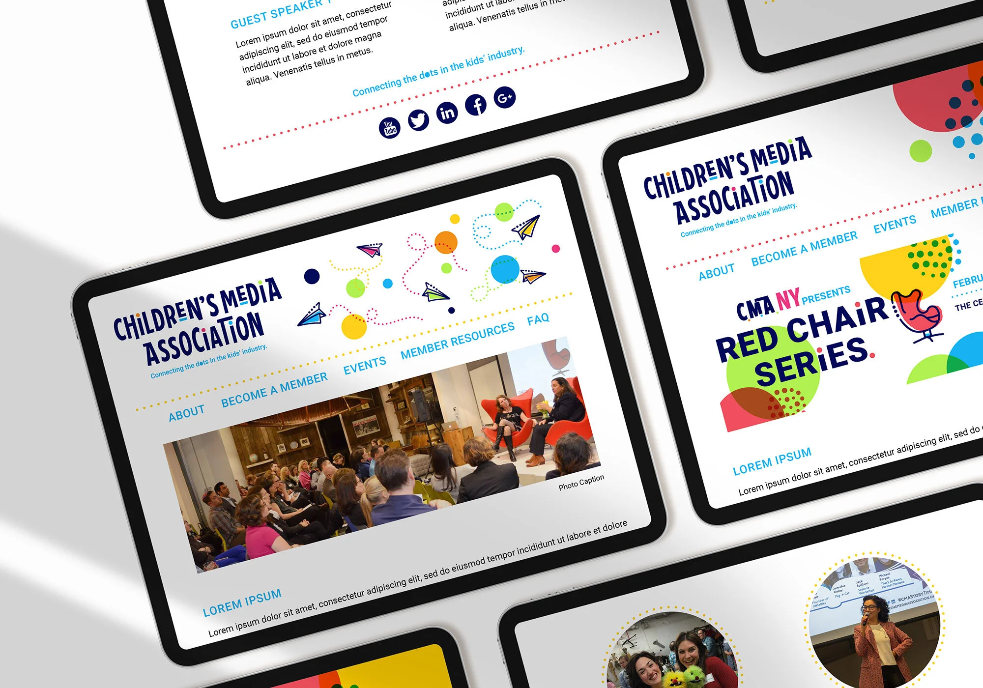
My relationship with CMA started when I was brought on as an Art Director to help them revamp their brand identity. The goal for this project was to create a vibrant, youthful brand that still adhered to the professionalism of committed producers and members who work for Nickelodeon, Noggin, and Sesame Workshop. The brand elements involved in this project included logos for their NYC, Los Angeles, San Fransisco, and National chapters as well as developing iconography, and marketing assets that all adhered to a cohesive brand identity.

PROCESS: BRAND REVAMP
Children’s Media Association’s original logo was simple and straight forward but it lacked a juvenile playfulness as well as a sense of cohesiveness with the branded collateral material. Furthermore, there seemed to have been an absence of consistency in chapter specific logos as well as the abbreviated CMA logo that is used on so many marketing material.
Click here to see old brand identity
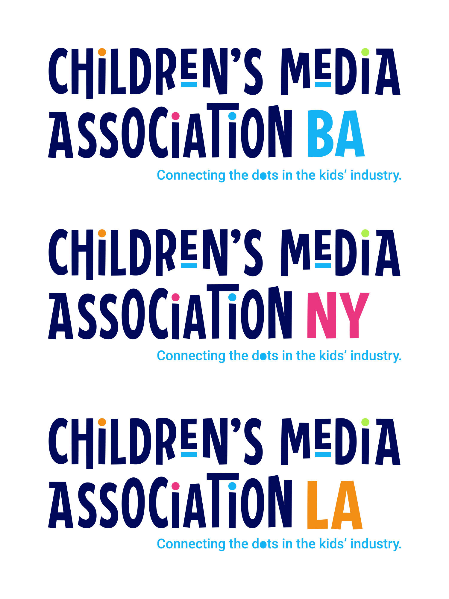
Through the beginning stages of research I was drawn to the use of the iconic “dot” used in the original branding. I liked the way that the shift of color created a sense of movement through the logo in a nice simplified way. With the addition of the new slogan “Connecting the dots in the kids’ industry” I was able to start refining the branding.
THE BRAND:
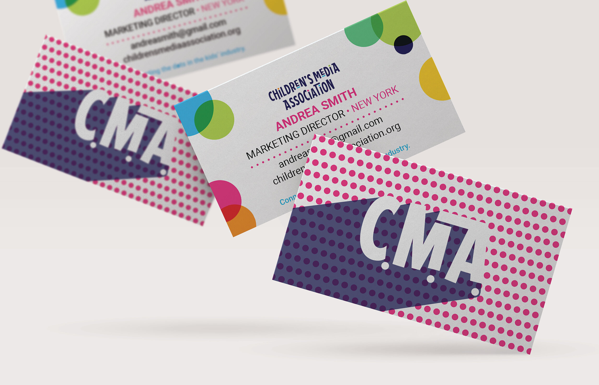
Expanding on the use of the “dot” element, I began to brainstorm on how it can be incorporated throughout the marketing assets in an elegant and playful way. I knew I wanted to transition away from the stagnation of the previous branding and bring in a bit more movement through the manipulation of the font used, placement of dots, and use of vibrant colors.
COLOR + ICONOGRAPHY:
The new color palette is a bright and vibrant take on the old palette. We chose to scale down on the choices of colors and choose a primary color palette for the main logos and incorporate a secondary color palette to ad into marketing assets and web comps. With three different CMA city chapters and the opportunity for expansion in other cities we wanted to use color as a way to differentiate and give each chapter it’s own unique personality.
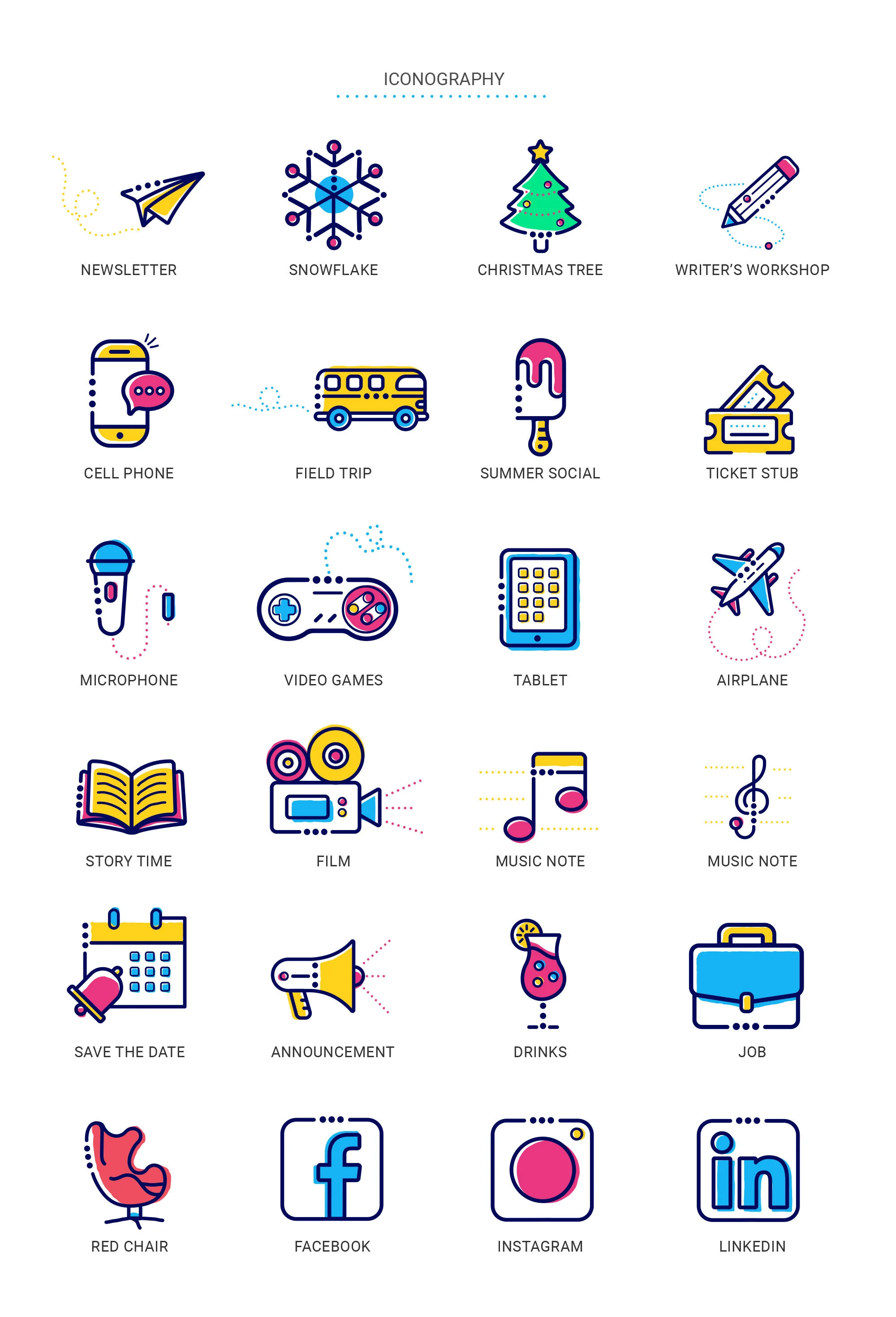
Throughout the year CMA hosts many events and workshops within their community. We made the decision to come up with a set of icons that can be used throughout all of their deliverables.